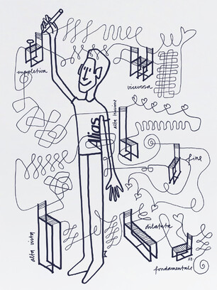
Spaghetti Chair 2015
Limited Edition inspired by G. Belotti
Alias, Italy
Ever since I met Renato Stauffacher, who lived in a house designed by Belotti, I’ve had a spaghetti chair. During an Alias designers dinner, I had the pleasure of meeting Giandomenico. I was impressed by the strength and independence of his works. Something that you will seldom find in products nowadays.
The spaghetti chair intrigued me right away. Not only because of its being so light, so graphical and radical, pared down to the minimum. Not only because of its being so comfortable and smart, but first and foremost because from the very start its proportions and materials spoke to me and communicated with me: when I was sitting on it or just standing in front of it, spaghetti talked with me. And this happened from the very start.
Tens of images came to my mind at once, together with stories and anecdotes to do with the spaghetti chair. I thought, if Giandomenico Belotti was able to design such an extreme chair before I even began to work as a designer, maybe these images that I’m seeing, this search for new interpretation could provide an occasion for joy. In actual fact, it is a profound and respectful homage to an iconic chair and its designer, Giandomenico Belotti.
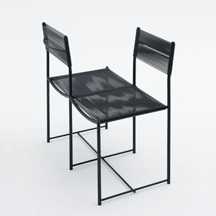
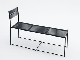
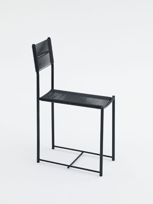
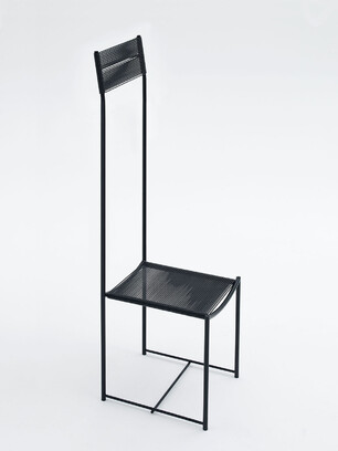
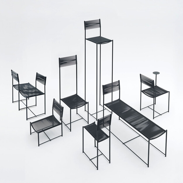
Seven unique pieces, seven creative gestures through which I have interpreted the first chair designed for Alias, an item that has become a symbol in the history of design and is now part of the permanent collections of the most prestigious museums all over the world. Characterised by its PVC threads, the spaghetti chair has captured ma fancy; I was left free to take it apart and put it back together again at his discretion, generating new different configurations:
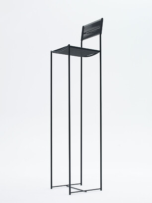
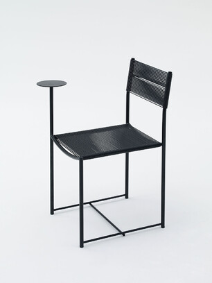
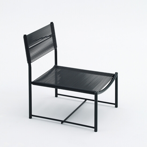
So the back is extended to the point of becoming a celebration of the Mackintosh chair. Broken down and deconstructed through a manipulation process, a variant with two adjacent seats comes to life. A solid version of compact design features a very low seat, close to the ground. Poetic is the version with a table built into the structure as an organic element. The 2-metre high version is a strong, architectural presence. Hyper-feminine is the proposal with a seat reduced to minimum size, while the version with a deeper seat seems to be changing into a bench.
