Rockefeller Dining Room 2016
Customized Furniture
Museum Haus Konstruktiv, Switzerland
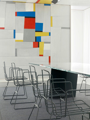
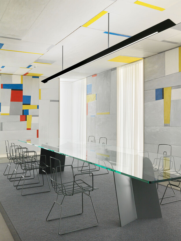
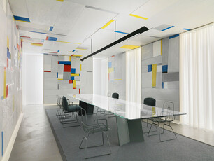
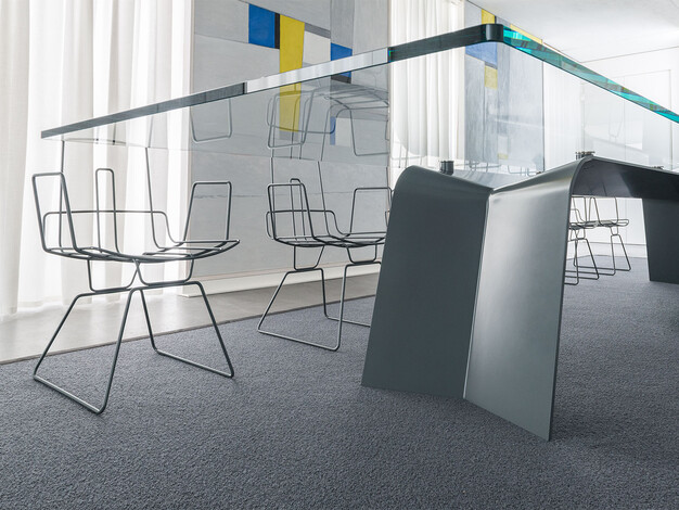
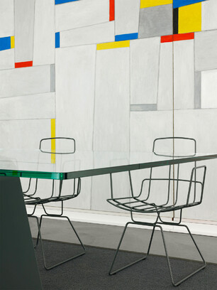
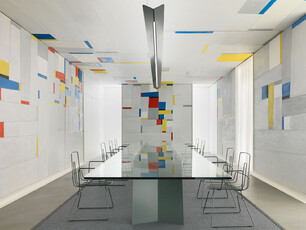
Initially, the idea involved restoring the original function of Fritz Glarner’s Rockefeller Dining Room – even though «proper» dining probably only takes place very rarely any more today. The goal was also to put an end to the wallflower existence of the original exhibition space, the completion of a tour through the various different exhibition rooms. The Rockefeller Dining Room lacked the impact of a worthy finale as well as the aura of being part of a comprehensive space design to showcase adequately, the walk-in work of art dating back to 1963/1964. Design work therefore focused on elements depicted in photographs from this period: table, carpet and upholstered chairs as well as curtains – not to forget the ceiling light so relevant to the exhibition. It was clear, however, that this form of intervention would have to hold back and primarily support the original artwork.
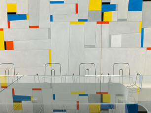
Glarner’s work of art is characterized by lines and surfaces that, when observed more closely are not rectangular. The new design elements also consist of lines (wire) and surfaces (sheet metal, glass and carpet). The large high gloss black lacquered table was replaced by a glass table that, on the one hand, reflects the interior design and on the other, thanks to its transparency, holds back to the degree possible – and this, despite its huge size of 4.8 m x 1.2 m. Without their padding, the chairs resemble a three-dimensional sketch. For use as dinner chairs, upholstered cushions in a special textile design were produced to ensure comfort. The reduced ceiling lamp ensures individually controllable direct and indirect light and was formally oriented to align with the design of the table base, thus merging excellently into the overall space - despite its generous length. The «fake» window alcoves were equipped with «real» curtain fabric to support decisively the original function of room lighting. The overall choice of varying shades of grey is aligned towards the color of the concrete floor and the main surfaces of the artwork. This restrained color scheme simultaneously ensures subordination to the work of art and expression of a designer’s respect for Fritz Glarner’s body of work, thus revisited.
Invitation Flyer
The Making-Of
Article in «Hochparterre» Magazine
Related projects:
Alambre
