Joop! Systemshop 2004
Shopdesign
Joop!, Germany
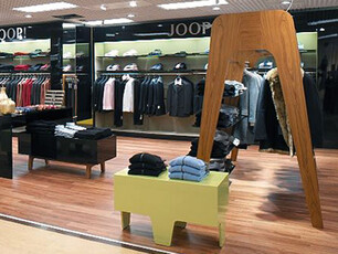
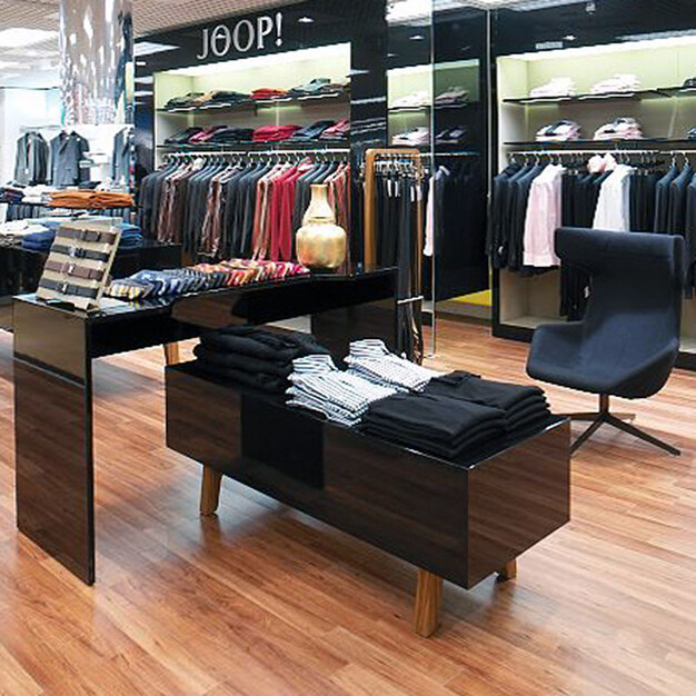
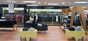
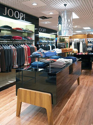
The basic idea behind this project was to coin the impression of the room with generous elements - sculptures, with clear functions and a plasticity as well as a high degree of recognition. The size is a novelty - I can walk through it - as well as the typology (pavillion, alcove, table-like display with a lot of light). The elements melt into the floor, thanks to the use of the same materials and distinguish themselves from it nonetheless, thanks to their form and serve as a contrast to wall, wall recess and ceiling. Individual components such as the cabinet or the glass displays can be opened from both sides.
The wall is integrated into a spacious niche, illuminated from above - an architectural solution than forms a whole, together with the ceiling. There are no furniture systems or a large number of shelves on the walls. The clothes can be hung into the integrated niche, the floor of which is used, in part, as exhibition space or as a base for the glass display or the cabinet.
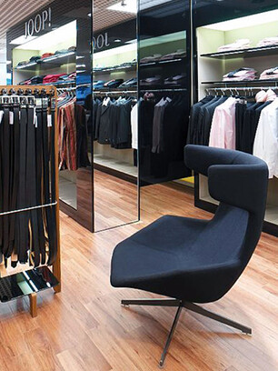
Similar applies to the ceiling: All downlights were built into it in a very free arrangement. I foresaw a more technical and flexible solution for the store windows in order to allow for the rapid changing of displays. In its depth, the store has a full width folding wall inspired by a screen in the Joop Castle. Hidden behind it are the fitting rooms and access to the storage room; mirrors were installed in between. Furnishing (seats, tables, carpets) as well as accessories (display feautres) can vary. They represent what has been accumulated and the extravagant - eventhough I do not see them in their opulence but in the classiness of their design.
